How the Best Websites are Handling Google's Core Web Vitals - and How Yours Can Too
Last updated: June 2024
Core Web Vitals metrics are fascinating measurements that judge the quality of web pages. The update is both innovative and frustrating while representing a big shift in the way Google is looking at websites.
The first search algorithm update that measures these Core Web Vitals rolled out during the summer of 2021. This update impacted search results on mobile devices. A second update which impacted desktop results landed in March of 2022. In May of 2023, Google added a significant a new metric called "Interaction to Next Paint," (INP) to Core Web Vitals.
|
Blue Compass' experts recorded a webinar all about Google's Core Web Vitals update! Check out the insights our panel provided as we walk you through what Google's Core Web Vitals are, how they impact websites and how to improve your performance score. This webinar is perfect for marketers, business owners and developers of all skills who are interested in improving their website's SEO. Watch the video, skip ahead to the questions you'd like to learn more about or keep reading to find out more information about Google's Core Web Vitals.
|
Core Web Vitals are measurements Google uses to judge, and ideally, improve websites. These are a big part of what Google calls the "page experience," which is really just Google's way of measuring how usable web pages are for users.
Every web page now has a Core Web Vitals score which primarily measures three things:
- Largest Contentful Paint (LCP)
This is the speed at which a web page’s content loads. Google wants content to load as soon as possible, preferably in 2.5 seconds or less.
- Interaction to Next Paint (INP)
A metric that measures how quickly the page responds to user input, aiming for 200 milliseconds or less. This metric is relatively new and is fully replacing Google's former metric, "First Input Delay," in March 2024.
- Cumulative Layout Shift (CLS)
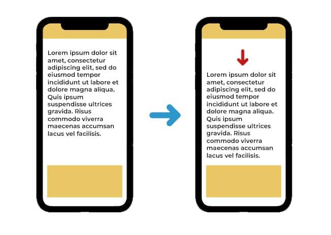
This is how many unexpected shifts in the page’s content occur with a target score of 0.1. Google wants as little shifting of web page elements as possible.

Tools For Core Web Vitals Testing
Understanding and measuring your website's Core Web Vitals (CWV) improves the user experience and enhances overall site performance. Core Web Vitals assessments like Lighthouse, PageSpeed Insights and Search Console offer unique insights into different aspects of your site’s functionality, enabling you to monitor and analyze vital metrics in real-time, over recent periods and throughout your site's history. By assessing mobile usability, loading speed, responsiveness, visual stability and overall SEO health, you gain the insights necessary to make informed decisions and optimize your website effectively.
Lighthouse: Real-Time Feedback On Core Web Vitals
For immediate CWV measurements of an individual web page and a clear understanding of what influences the score, turn to Lighthouse. The real-time CWV score provides you the opportunity to instantaneously identify loading issues that are impacting the user experience right now and helps you determine actionable steps to address them. Let’s explore how to access Google Lighthouse through Chrome Dev Tools:
- Visit one of your web pages in an Incognito window of Google’s Chrome browser
- Right click and select “Inspect”
- Click on “Lighthouse” in the top menu
- Click the “Generate Report” button
Note: It’s important to ensure you do this in an incognito window, otherwise stored data may interfere with loading and give you an inaccurate score.
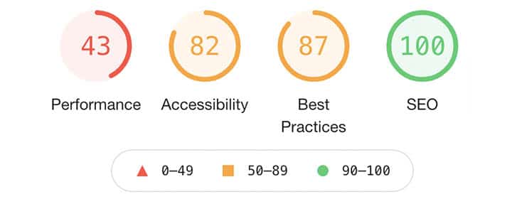
This process will generate four numbers rating your page’s performance, accessibility, best practices and SEO. Each is rated on a scale of 0 to 100, with 100 being the best. Your Core Web Vitals score is found within the Performance score.

Lighthouse provides valuable instant feedback, however you might notice the scores appear low. This is due to its testing parameters—an older Android device and a sluggish 4G connection, simulating the worst-case performance of a single webpage. Despite the strict assessment, Lighthouse offers crucial insights into areas where enhancements can benefit all users.
PageSpeed Insights: User Experience Analysis Over 28 Days
Developed by Google, PageSpeed Insights evaluates web page performance within the last 28 days. With access to four weeks of user-generated data you can easily identify CWV trends and plan optimizations based on the page’s user experience strengths and weaknesses. With a mobile and desktop toggle as well as real-time insights at the bottom of the report, PageSpeed Insights doesn’t leave much to the imagination! Additionally, it provides recommendations for how to improve your CWV score including optimizing image sizes and reducing unused scripts.
Offering insights into several areas of the user experience, makes it accessible for both marketers and web developers to use the data to improve page performance. However, similarly to Lighthouse, PageSpeed Insights uses emulated mono G Power, slow 4G throttling and an old chromium browser to test the page.
Search Console: Historical Data and Error Tracking
If you’re looking to thoroughly examine your site’s user experience and identify specific pages with errors, we recommend using Search Console to monitor Core Web Vitals metrics. Unlike simple snapshots, Search Console offers comprehensive historical data, granting access to both user experience-focused metrics—such as Core Web Vitals and page load speed—and search engine performance metrics like average position, index coverage and crawl errors. Its page-level insights provide targeted optimization opportunities, pinpointing specific pages with errors, categorizing them and offering resources for resolution. Ultimately, Search Console serves as an indispensable tool, equipping you with the necessary information to enhance your site’s user experience and boost its performance in search results.
Although Search Console is a valuable tool, it does have its limitations. For newcomers, the interface may initially seem complex. Additionally, the data in Search Console isn't always current, as it updates only every few days.
As you start to explore the tools available for testing Core Web Vitals, it's crucial to understand the significance of these metrics.
Keeping an eye on Core Web Vitals metrics holds significance as Google has incorporated them into its ranking algorithm. Websites with favorable CWV scores stand a better chance of ranking higher in search results, thus drawing more organic traffic. Furthermore, optimizing for Core Web Vitals not only boosts overall website performance but also enhances user experience, satisfaction and engagement.
When Core Web Vitals were first announced in May 2020, Google said it would be used as a ranking signal beginning May 2021 (the date has been pushed back to June 2021), giving digital marketers an entire year to make adjustments. If a webpage has a good score, it may receive a rankings boost and possibly a badge icon in mobile search results. These search engine optimization benefits are the reason most digital marketers are so focused on Core Web Vitals metrics.
We're announcing that page experience ranking signals for Google Search will launch in May 2021. This will combine Core Web Vitals and previous UX-related signals.
Learn more: https://developers.google.com/search/blog/2020/11/timing-for-page-experience
— Google Search Central (@googlesearchc) November 10, 2020
It’s best to follow Google’s guidelines and improve your website’s user experience, such as how quickly pages load and mobile-friendliness. Google is currently the king of search and following its best practices is a wise move for any website owner. However, we suggest you don’t blindly follow all of Google’s decrees. Always test and monitor new features and suggestions because Google doesn’t have a perfect record for remaining consistent.
Over the years, our digital marketing team has seen numerous cases where Google has told website owners to do one thing, only to change their stance later.
For instance, a few years ago, Google allowed websites to display longer meta descriptions in its search results. While many websites quickly seized the opportunity to expand their descriptions, we strongly suggested our clients hold off to see if this update was permanent. Sure enough, a couple of months later, Google reversed its decision, going back to the shorter meta description format. Suddenly, the websites that lengthened their descriptions had their new copy cut off in search results.
Our stance is simple: follow Google’s best practices - but not blindly. Always monitor and test Google’s guidelines to ensure they’re accurate and truthful.

Google's Core Web Vitals guidelines serve as a reliable framework for improving both user experience and website performance. Through metrics such as Largest Contentful Paint (LCP), Cumulative Layout Shift (CLS) and Interaction to Next Paint (INP), these guidelines provide a comprehensive understanding of user interactions. This data-driven approach guarantees optimized websites, facilitating faster load times, consistent visual content and responsive interactions. Despite their inherent complexities, these guidelines effectively steer marketers and developers towards achieving optimal technical performance and content quality.
Throughout late 2020 and the first half of 2021, Google frequently changed the requirements and the measurements of this score. Since expectations keep changing, it’s hard for website owners to keep consistently solid scores.
Our team has updated our development practices to better follow Google’s guidelines, but only to an extent. Core Web Vitals are still young, thus we won’t fully change all our development processes yet just based on Google’s suggestions.
For instance, Google is suggesting websites use next-generation images like JPG 2000. Doing so may improve your web page’s Performance Score, but not all browsers support that image format, so many website visitors won’t even be able to see these images.
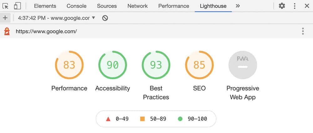
Follow the best practices as much as possible, but don’t let Core Web Vitals scare you. Is your site going to plummet in rankings if you don’t have all 100% scores? No! In fact, below is a look at the score of Google.com on mobile. As you can see, currently even Google doesn’t score 100’s.

Having a poor Performance Score isn’t going to remove your site from Google search. In fact, the impact may be minimal to your site. However, it is a good idea to stay on top of this metric and make your site perform as quickly and smoothly as possible. If you can improve these metrics, you have a better chance of getting more attention from both Google and your target audience.
While there are many updates that can improve your website’s Core Web Vitals, here are the four main improvements we’ve found make the biggest impact.
#1: Decrease Third-Party Plugins on Your Website
Your website likely has at least a few third-party plugins or tracking scripts. These are typically bits of javascript code that a developer has input on certain pages of your site. Examples include Facebook pixels, Google Tag Manager, Google Analytics, Google’s reCAPTCHA, and Hotjar.
These plugins are often very important for your marketing goals. Still, each one slows down your site’s Largest Contentful Paint (and yes, it’s a bit ironic that adding Google code to your webpage negatively impacts this score that Google invented).
Do an audit of these plugins and remove the ones that aren’t vital. Also, check to see if there are newer versions of each plugin that may load faster. For instance, we found that Google’s reCAPTCHA version 2 was really slowing down a web page’s loading, so we upgraded to reCAPTCHA version 3 and found it loaded much faster.
#2: Decrease the File Size of Your Website’s Images
Ensure the images on your website are the proper dimensions and adequately compressed. A 5 mb image, for instance, is simply too big for your website and creates load times that will hurt your Core Web Vitals metrics and cause visitors to leave. As a general rule, try to keep each of your images under 100 kb.
Google also suggests your images load asynchronously via lazy loading. We’ve seen this practice significantly improve Performance Scores.
#3: Eliminate Any Unnecessary Shifts in Content on Your Website
Many websites use animations to move content around the page. Google suggests avoiding this because it can cause someone to click on something accidentally as the shift occurs. Try to avoid content that moves from one point of the page to another (ironically, this is something that Google itself is guilty of in some of its search results).

#4: Ensure Responsive Handling of User Input and Form Submissions
It's crucial that your website responds promptly and appropriately to user interactions, especially form submissions. Users expect instantaneous feedback when they submit a form, such as a confirmation message or a visual indication of progress. Implementing client-side validation to instantly catch errors in form submissions can help reduce the likelihood of users submitting incorrect data and having to wait for server-side validation. This not only improves user experience but also reduces server load.
Incorporating Interaction to Next Paint (INP) can further enhance user engagement. When users submit a form, instead of just waiting for the server response, you can utilize INP techniques to dynamically update the interface, providing visual feedback that the submission is being processed. This keeps users informed and engaged, and reduces the perceived waiting time.
Reach Out to Our Digital Experts About Core Web Vitals Metrics
Our team of developers and digital marketers have spent hundreds of hours improving and testing Core Web Vitals to make a positive impact on user experiences and SEO. We’re happy to give you a hand with your website and answer any questions you have! Please reach out to our team of search engine optimization experts in Des Moines and let us know how we can assist.
Drew Harden
CEO and Co-Founder of Blue Compass, Drew Harden has grown and guided the company from a two-person startup in 2007 to one of the Midwest's leading digital marketing companies today. He's a published author, has been cited by PR News and USA Today, and has led web projects that have been honored by organizations like Adobe and American Design Awards.