Have You Seen This Popular Trend? Try Diagonal Website Designs
If you’ve been sifting through websites for design inspiration lately, you’ve probably noticed a popular geometric web design trend: diagonal line design. This website design style can transform a traditional website into a creative design by simply tilting content to give it a modern edge.
What Is Diagonal Website Design?
There are many examples of what diagonal design looks like, and our web design and development experts plan to go through some of their favorite examples. Overall, the most popular diagonal line design elements include:
- Diagonal design accents
- Angled layout sections
- Diagonal or geometric shapes
- Slanted headers
When trying to incorporate diagonal lines in their designs, website designers need to keep in mind that the objective of having an attractive design is to make your content on the page come to life, not distract users from their task once they get to your site. While this trend can make a stale design more interesting, diagonal designs can also make a layout too complicated or distracting to users when they’re not done tastefully.
An effective geometric web design can also lead to a great user experience (UX). The lopsided or slanted appearance of diagonal designs naturally draws the eye across the whole layout and keeps visitors scrolling to see the entire page. This extra guidance created by using diagonal website design allows the designer to enhance the content of the site, and, in some cases, increase conversions by leading people to key conversion points.
Inspiration And Examples For Diagonal Line Design
Ready to see some of our team’s favorite examples? Take a look at some of the different ways you can incorporate diagonal design elements to enhance your site.
Diagonal Website Design Accents
BSB Design

A photo grid dominates BSB Design’s portfolio page, showcasing the architecture firm’s commercial and residential design projects. When you hover over photos, playful and colorful diagonal labels pop up, encouraging users to click to find more information about the project. The slanted lines contrast nicely with the straight lines of the square grid.
Diagonal Line Designs With Angled Layout Sections
Timberline Tours
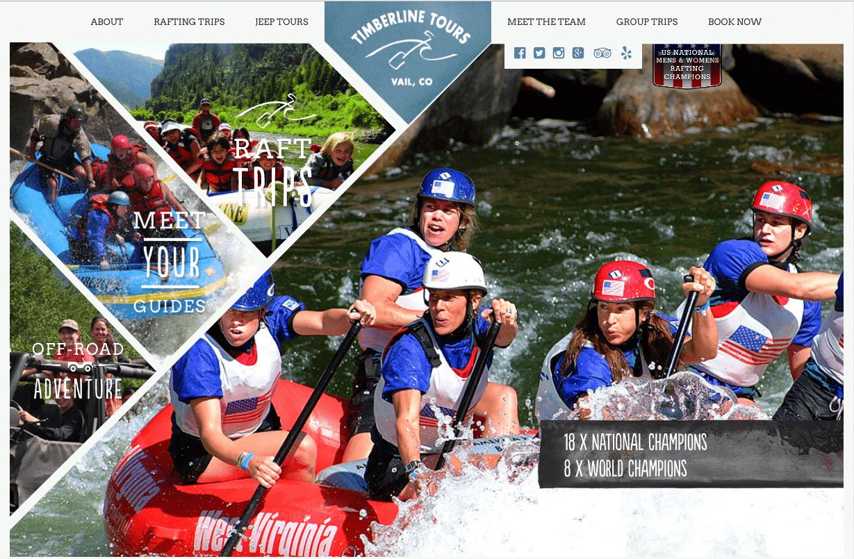
This is one of the most unique angled layout sections we’ve seen. Timberline Tours does a great job of showcasing their action-packed photos while using a unique diagonal design to call out their river rafting and adventure tours.
McAninch
 Sometimes, a diagonal website design just makes sense for a brand. That was definitely the case with McAninch, an earthmoving and underground utility company. Their homepage was inspired by the diagonal line design of their logo. It prominently features their brand colors, bold photography and, of course, diagonal design elements.
Diagonal Or Geometric Web Designs
HK Solutions Group

This geometric web design features diagonal lines and interesting geometric shapes also inspired by their company logo. HK Solutions Group plays off the K shape in the header to draw users in with unique diagonal line design elements and helps lead them to learn more about their industrial and municipal services.
Collect.io

The header and footer of Collect.io are laid out at a steep angle and with fun and exciting colors to draw you in. They also use some geometric shapes and staggered content sections to continue the diagonal line design throughout the layout.
Slanted Headers For Subtle Diagonal Design
Stripe

A header with a subtle diagonal line design leads users’ eyes down the page on Stripe’s home page. The header also takes advantage of another popular web design trend by incorporating bright and powerful gradients - the contrast of the colorful background and clean, empty white space gives the site a fresh, modern look. The diagonal line design continues as you scroll, adding interest throughout the various sections on the home page.
The Community Foundation Of Greater Des Moines

Another example of a great diagonal website design is The Community Foundation of Greater Des Moines. Their homepage header features a diagonal line design that draws users’ eyes down the page. A drop shadow adds additional dimension and interest.
Add Diagonal Line Design To Your Website
Many of the designs in this blog were created by Blue Compass’ team of web designers and developers. If your team wants a responsive web design that’s stylish and enhances conversions, reach out to our award-winning responsive website design company today!