Web Design Navigation Best Practices & Examples
Your website’s homepage design could have a serious impact on how users interact with your website and whether or not they choose to click to a new page to continue learning more about your business. Is your website using a popular navigation trend that may be hindering its performance? Our web design experts break down the hamburger menu navigation and why this option may not follow web design navigation best practices.
What Is Hamburger Navigation?
Hamburger navigation refers to those three lines most likely in the top right corner of a site which symbolize the rows in a menu, which kind of look like a burger. This hidden navigation indicates that a click or touch will reveal the website menu.
This hidden menu navigation rose to prevalence a number of years ago, mainly because mobile versions of websites didn’t have enough room to fit all of the site’s main navigation, so this hamburger navigation menu option simply saved space and made things look less cluttered.
While the hamburger menu started being used as the best website navigation on mobile versions of websites, it soon rose to prominence on full desktop versions of websites as well because web designers loved the simple, clean look.
Is A Hamburger Menu Bad For Your Website?
Based on our user experience testing, hamburger navigation is not a good solution for the desktop version of your website. You should only use a hidden navigation when it is absolutely necessary, such as on mobile menus, or if your website has far too many pages to display in the main navigation.
For example, a few years ago on Blue Compass’ previous website, we briefly tested out a hamburger navigation menu when it first started becoming known as a web design navigation best practice. This simplified the look of our homepage, bringing more attention to the information on the page. Through user experience research methods, we ran an A/B test on the homepage for three months - half of the users that came to the Blue Compass homepage were shown the hamburger navigation, while half were given a full website navigation example. We gathered data from thousands of visitors and analyzed how they interacted with the best website navigation and saw some interesting results:
- 15.5% of users who experienced the hamburger menu as the main navigation clicked through to another page.
- 27% of users who experienced the traditional main navigation clicked through to another page.
That’s a 74% increase in the percentage of navigation clicks on the homepage when a clear, direct navigation is used!
Our team has run many user experience tests on our clients’ websites and has seen similar results each time. We’ve determined that the main problem with hidden menus is the principal of “out of sight, out of mind.” If your site visitors can’t easily see the areas of your site, they’re less likely to visit multiple pages, and you want your visitors to spend as much time on as many pages as possible.
Additionally, the hamburger navigation makes your visitors have to perform an extra click to get where they want to go. If you put yourself in your audience shoes - you’d probably rather have free access to where you want to go instead of having to click to see the navigation options.
Hamburger menus look nice, but ultimately make it more difficult for your audience to find your content. For this reason, we believe these are not recommended as the best website navigation anymore. So, we’ll direct many of our clients’ websites to feature full, visible navigation on desktop. then, slowly reduce those options as the device gets smaller, until there’s a hidden menu on mobile, where saving space is essential.
Consider staying away from hidden menus and following other web design navigation best practices - at least on the desktop version of your website. Allow your visitors to see a few, clear navigation options at all times, wherever they are on your site. Your audience will appreciate it and your pages visited per session should improve.
4 Creative Website Navigation Examples That Offer An Alternative To Hamburger Menu Navigation
The hamburger menu has been a common and best website navigation choice for responsive web design over the past several years, but there are a few more website navigation examples that follow web design navigation best practices and are shining a new light on website menus. Below, we’ll showcase four sites that are doing a great job using alternatives to the hamburger menu navigation.
1. Bottom Navigation

As we all know, the most common location for a navigation bar is at the top of the page. Some websites, like nstudio, are shaking it up with bottom navigation, and we love it. Placing the navigation at the bottom of a website allows users to focus on the core design elements and functionality. We’ve all browsed a website that has a navigation bar which takes up a quarter of the screen. Navigation bars like that keep the audience from getting to the most important content first.
The bottom navigation still offers a clean look and direct access to the navigation bar, but it’s taking up less of the prime real estate at the top of the screen. Plus, users can still navigate the website with one simple click. No searching for the menu, opening and closing or getting lost!
2. Four Corner Navigation

The four corner approach is very unique, but it really helps to focus the eye to the center of the page. This alternative to the hamburger menu has a simple yet unorthodox approach that makes it stand out. This is the best website navigation option for centrally focused layouts, like this Proud & Punch website. It’s a simplified approach to a more standard navigation and guides users to search all “corners” of your website.
The downfall of a design like this? It can be confusing to users who are not used to this type of website navigation. If you’re considering a four corner approach, be sure the page is simple, so the navigation elements don’t get lost. Additionally, our web design and development team agrees that you need to make sure elements are large enough for users to identify quickly. The last thing you want is someone getting confused and leaving your website.
3. Vertical Sliding Navigation

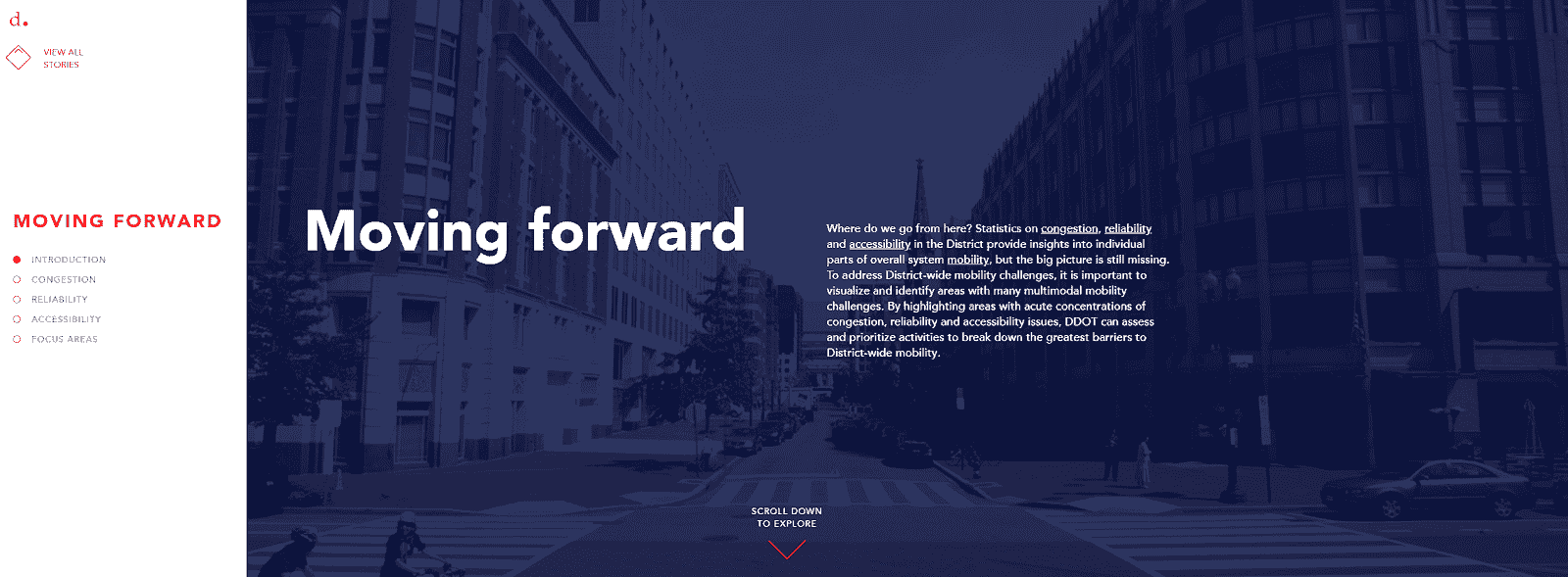
The vertical sliding navigation is popping up rapidly, and we don’t see it slowing down anytime soon. What exactly is a vertical sliding navigation? Exactly what it sounds like! On the District Mobility website pictured above, simply slide over the left sidebar, and a vertical navigation appears. This type of design takes up less space at the top of the page, a huge benefit to going with a vertical integration.
It leaves an uncluttered canvas, which allows you to focus on the rest of the design. The navigation is easy to scan so long as there is adequate spacing between the elements. We like this look because it leaves an overall clean aesthetic.
4. Full-Screen Navigation

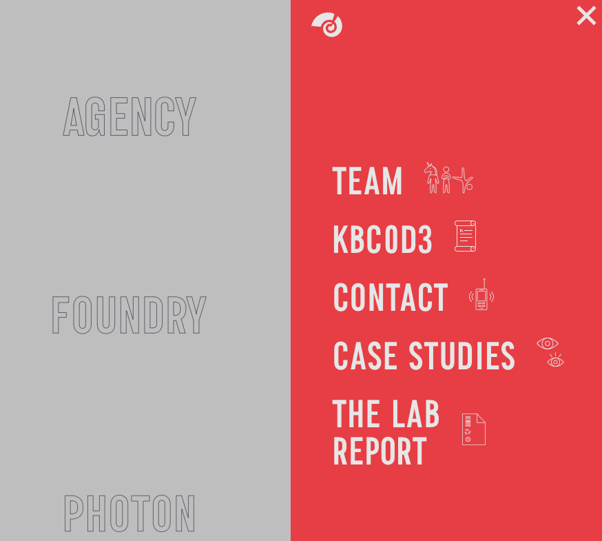
On this website navigation example for KOBU Agency, the menu is the design. This design that covers the entirety of the screen leaves plenty of room for menu items without sacrificing style. It gives a clear and direct roadmap to navigate the website. The simplicity is a breath of fresh air and entices you to engage with the website.
Try Out One Of These Website Navigation Examples For Your Next Web Design
These non-traditional navigation styles can add a little bit of fun to your website. Our Iowa web design experts like all of these options because they put the main focus on the design and functionality, without sacrificing the importance of navigation. Next time you’re working on a new responsive design, consider these alternatives. Whatever alternative to the hamburger menu you choose, we encourage you to run heatmaps, UX testing and look at your analytics to see what’s effective, then continue to monitor and optimize your web design.
Need a little help from Blue Compass giving your website a refresh? As a responsive web development and design company, we can help! Fill out our form below to see how we can take your website to the next level.